
WK04
Graphic Design 101
Color · composition · typography · layout — make work that doesn't look bad
Graphic Design 101
LAAR 61400 · Week 04
#000000

Move one slider at a time — each dimension changes the color independently.

RGB · light · screen additive
R255
G255
B255

Starts black. Adding all channels → white. This is your screen.

CMY · ink · paper subtractive
C100
M100
Y100

Starts white (the paper). Adding all inks → near black. This is your printed board.

Warm advances · comes forward Cool recedes · falls back Hue

Pick a scheme — then click any hue to set the base color.

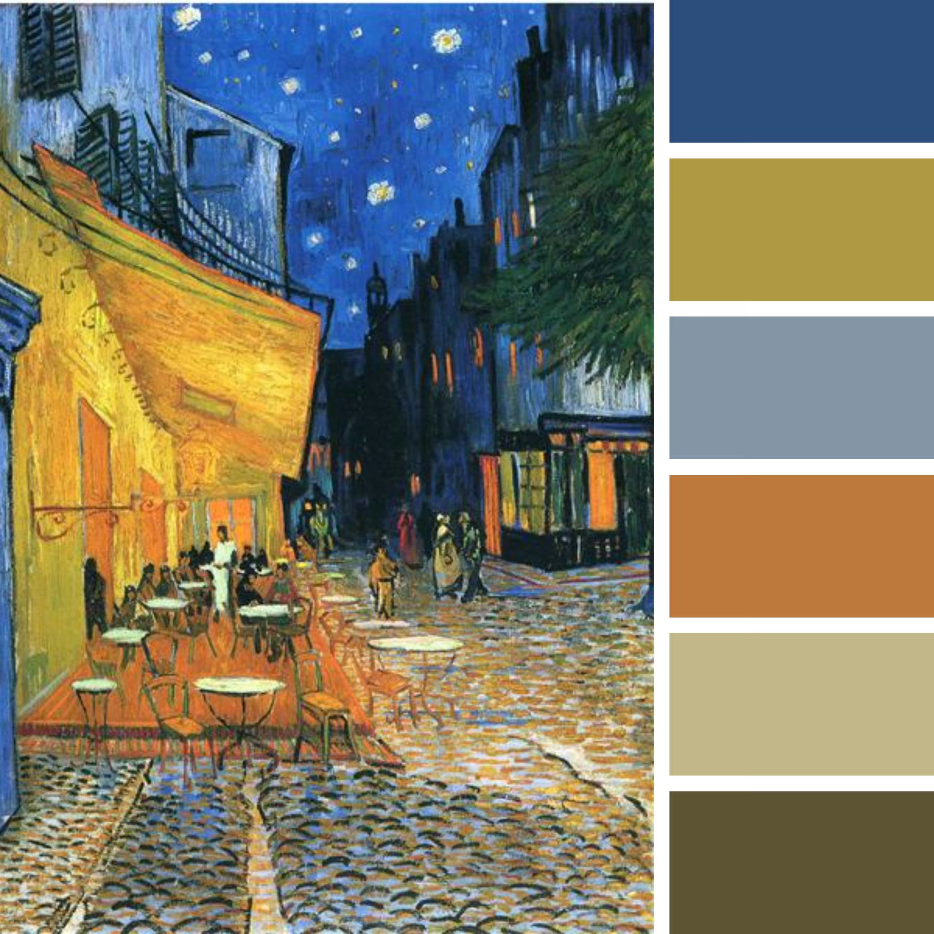
Van Gogh, Café Terrace on the Place du Forum, Arles, 1888
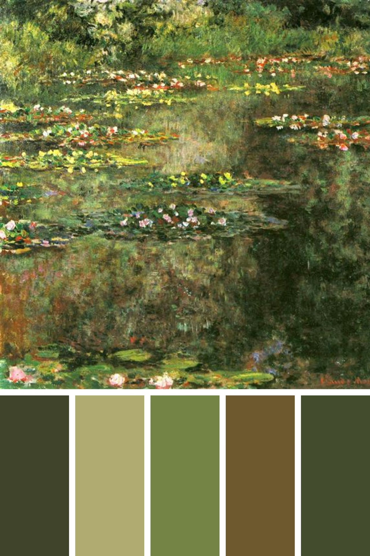
Claude Monet, Water Lilies, 1904
Strong value range
All mid-value

Both look fine in color. Now drop the hue — which one still reads?

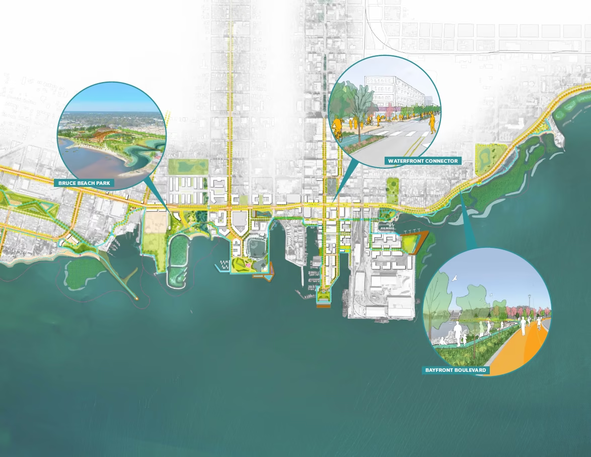
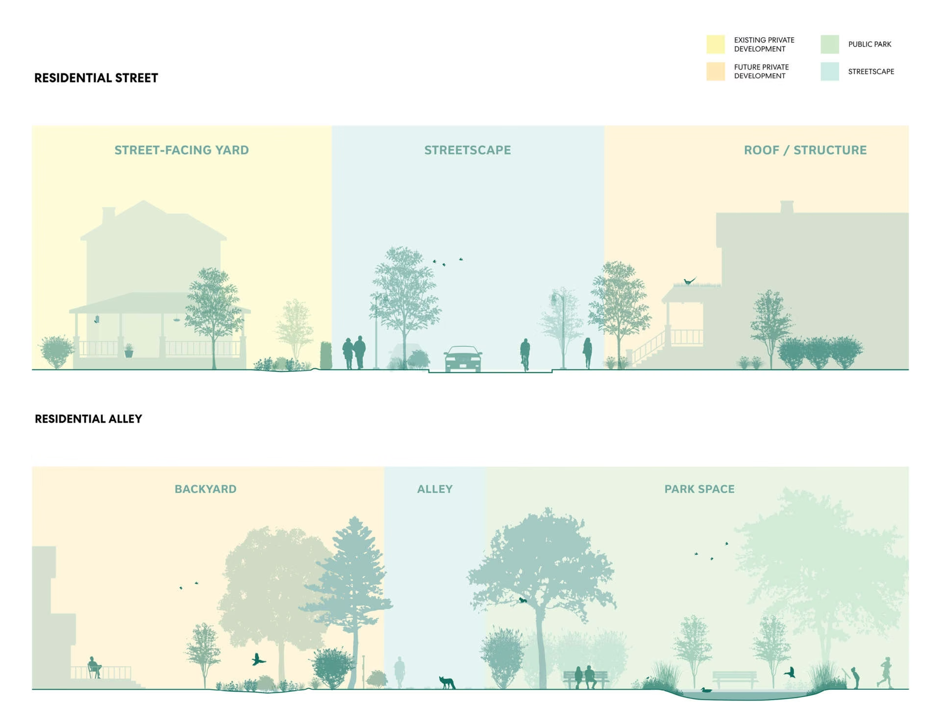
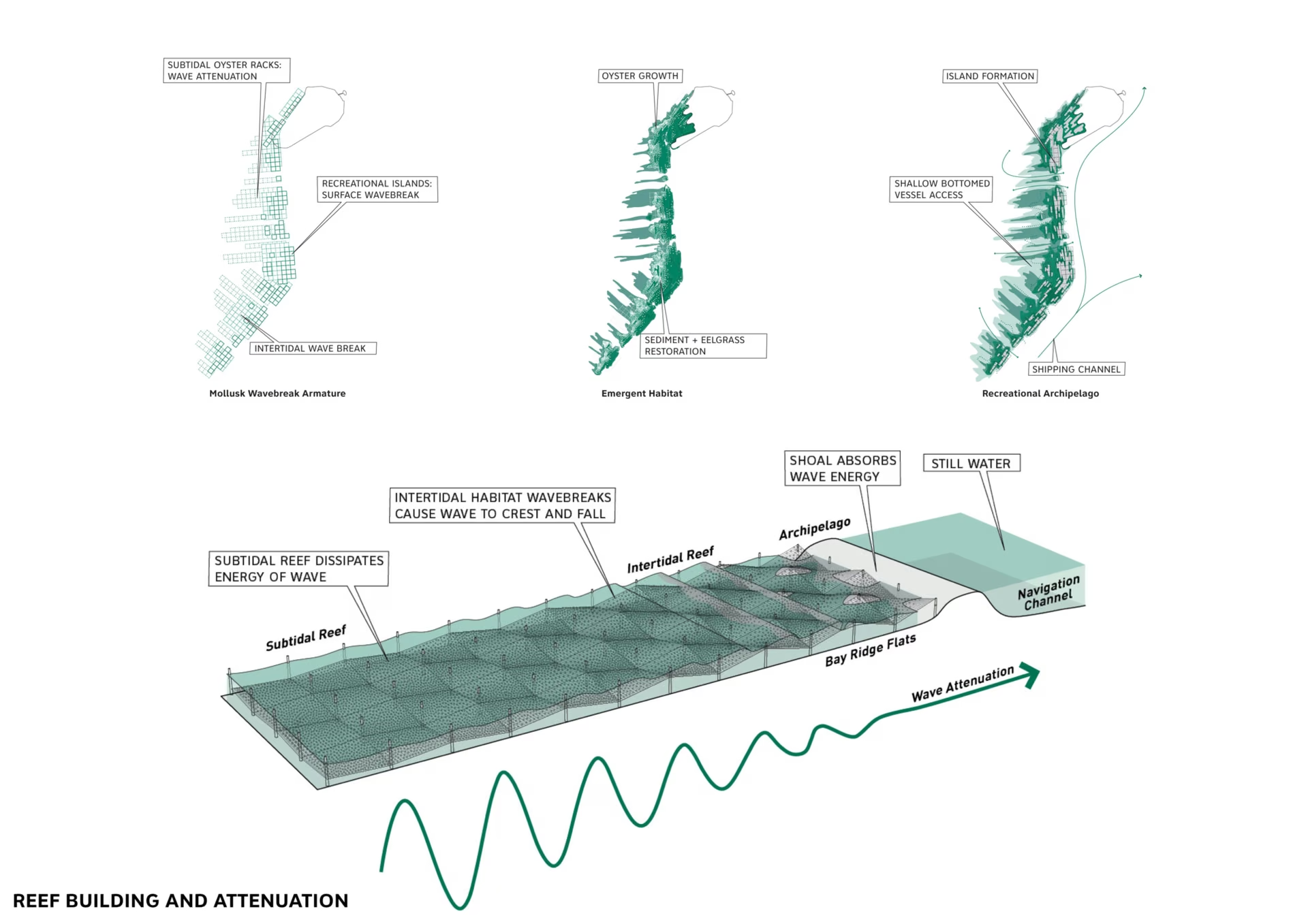
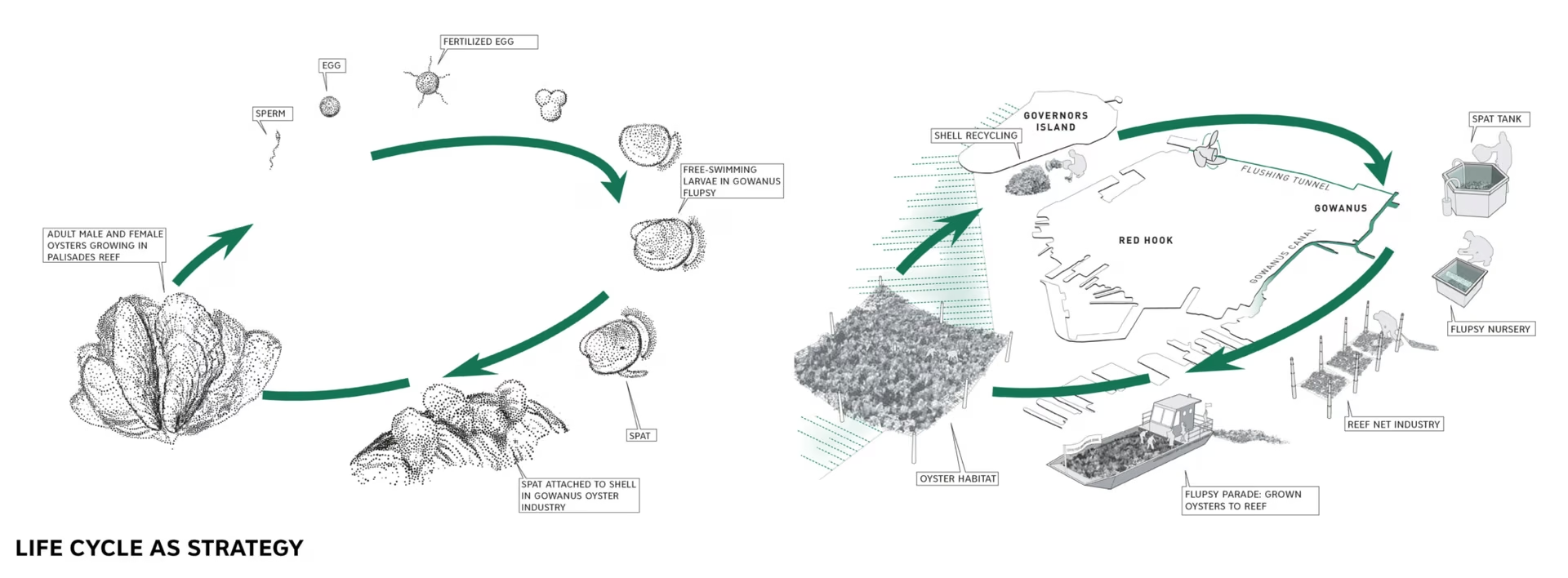
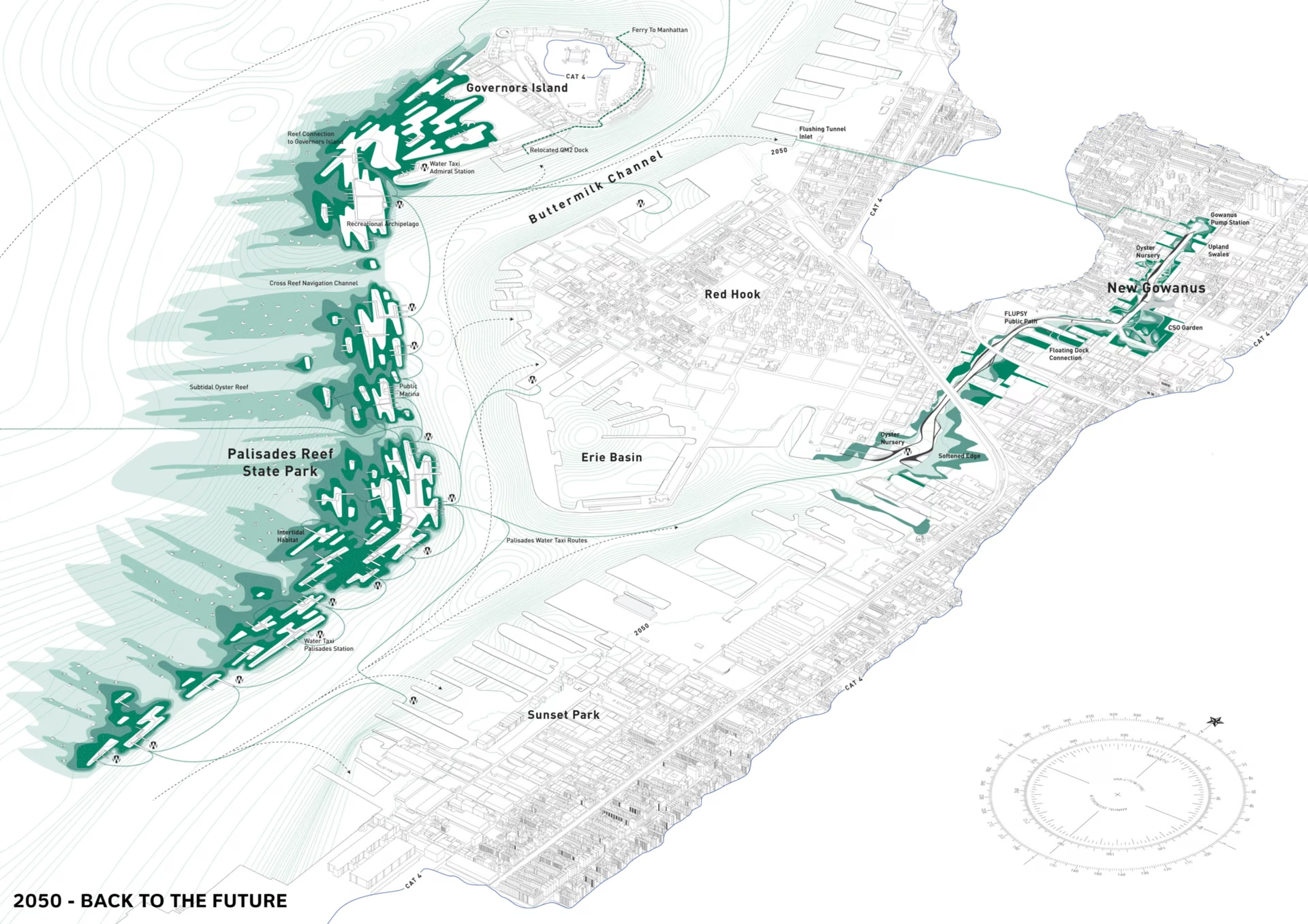
SCAPE drawing
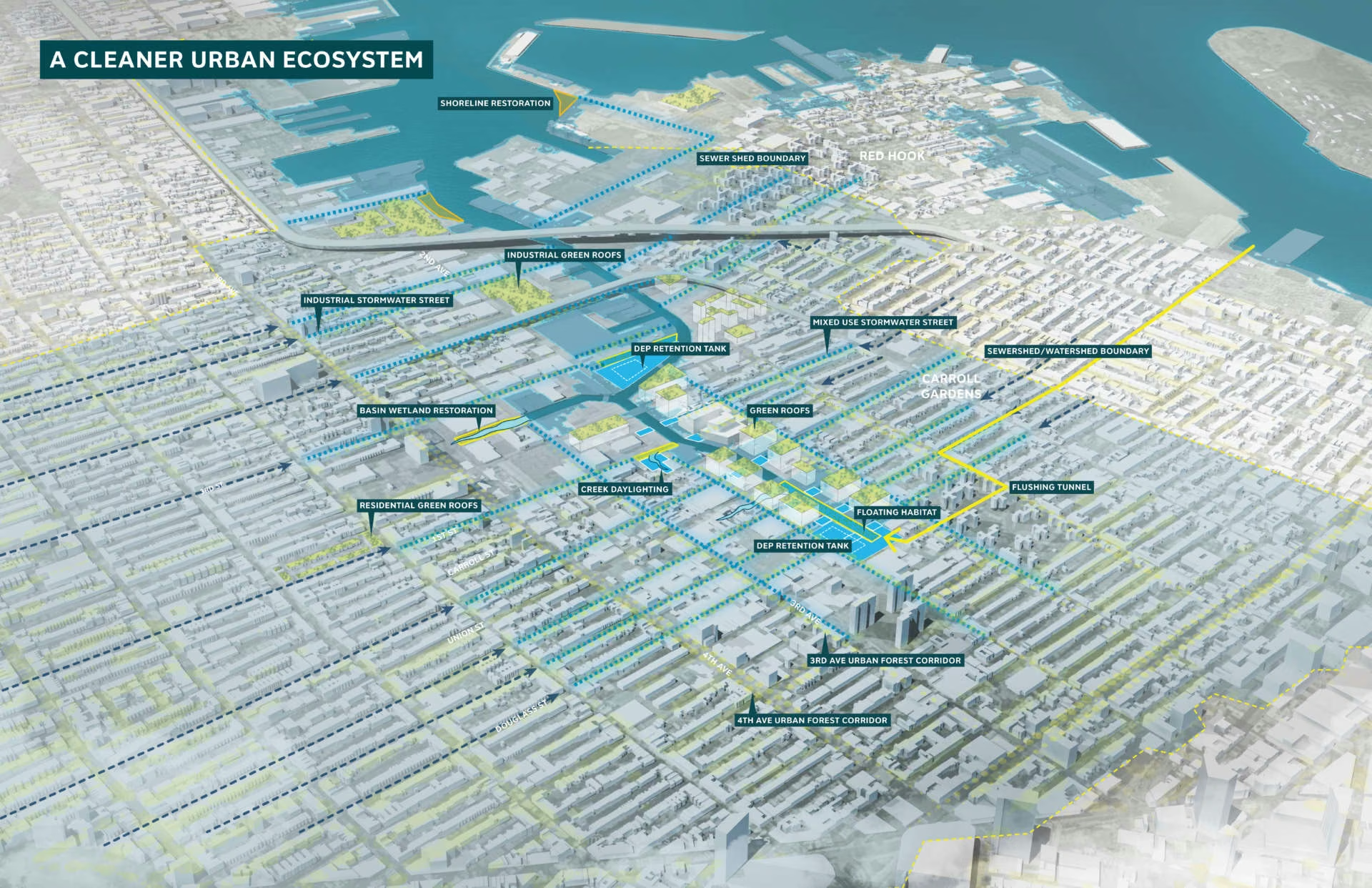
SCAPE drawing
SCAPE drawing
SCAPE drawing
SCAPE drawing
SCAPE drawing
SCAPE drawing
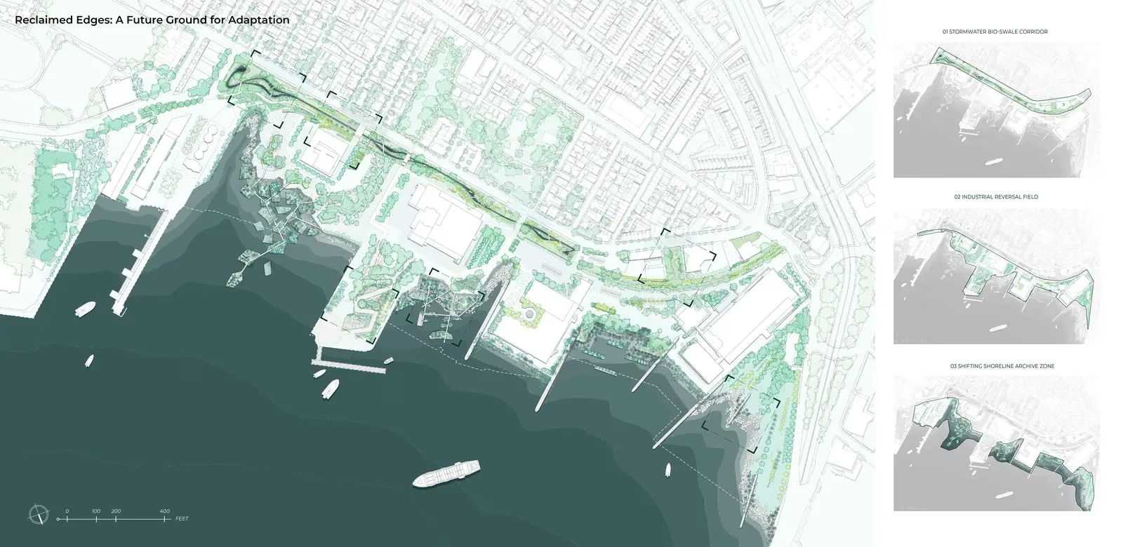
Zhiming Zhang, 2025 Student ASLA Honor Award
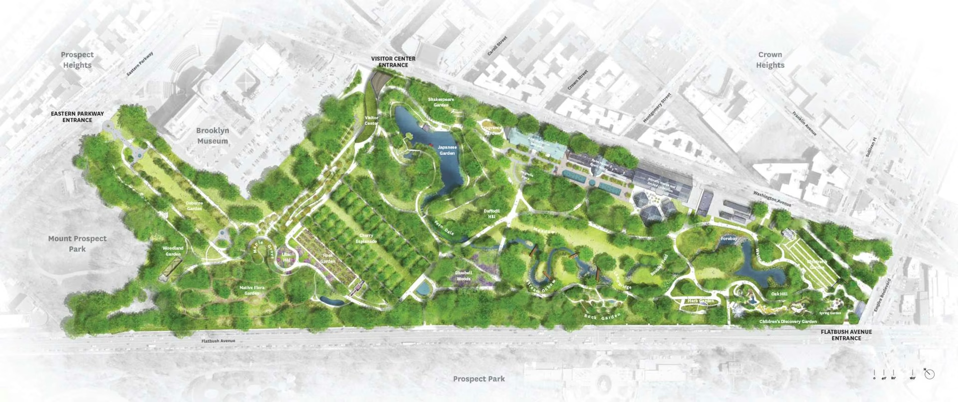
MVVA, Brooklyn Botanic Garden
Before — almost aligned
After — snapped to shared edges
12 columns × 12 rows — one skeleton, snap everything to it
Anchor
image
image
Title
caption
Bleed art past the cut · ~0.125" Trim final page size / cut line Margin edge → content frame Safe area keep content inside margin Column Gutter space between columns
Symmetric — formal, static
Asymmetric — dynamic, balanced by weight
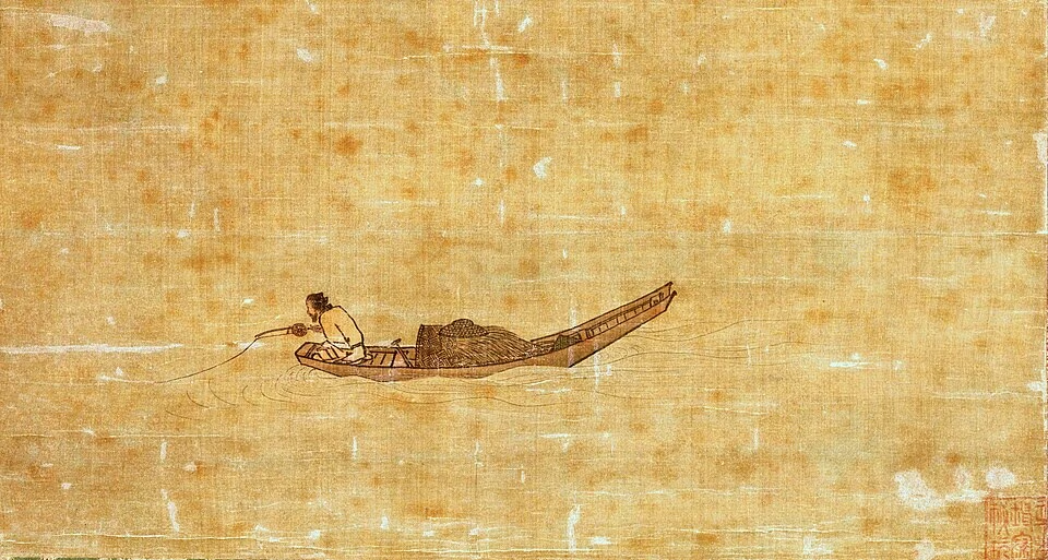
Ma Yuan, Angler on a Wintry Lake, Southern Song dynasty
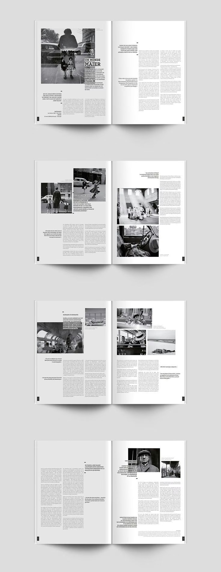
A page composition using white space
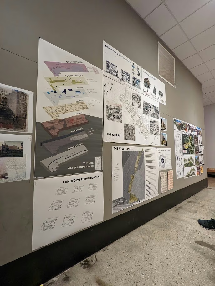
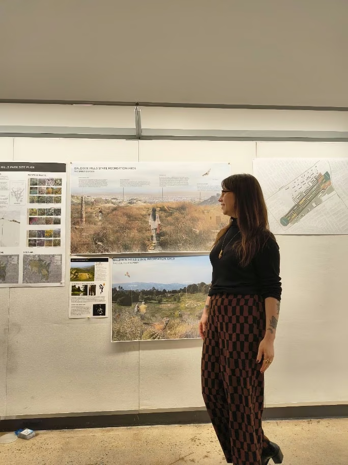
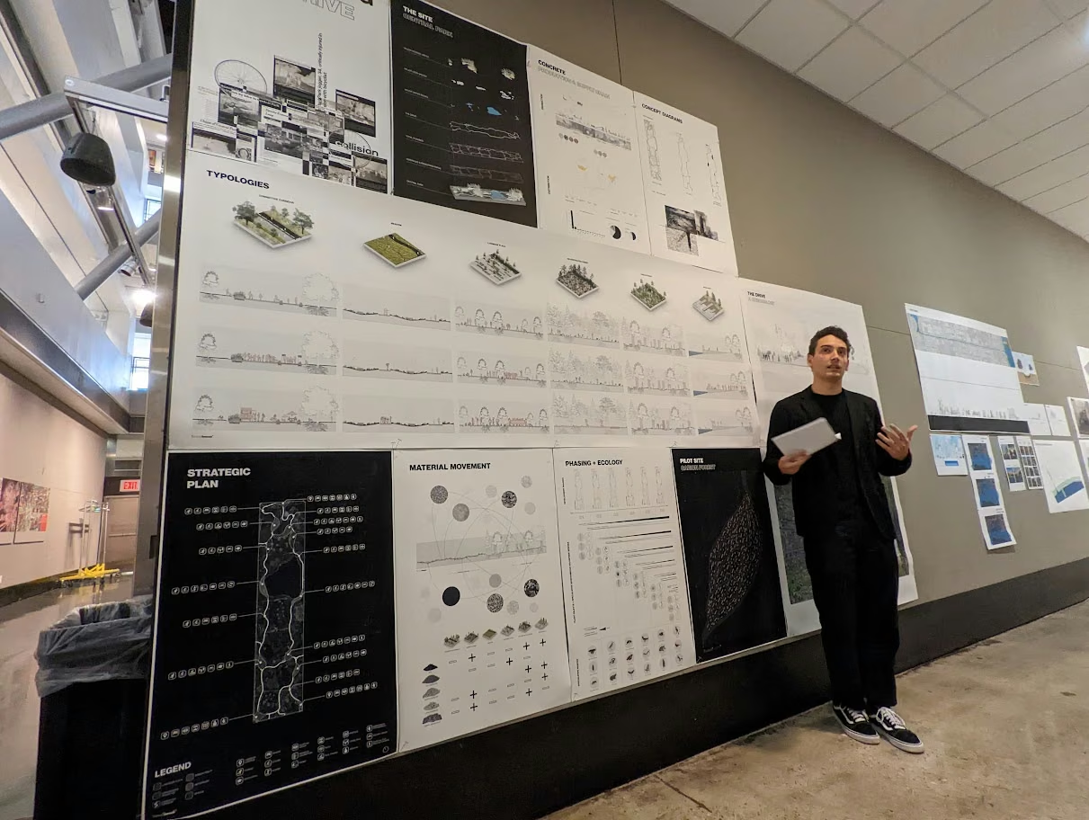
Student board
Student board
Student board

And you will read this last

You will read this first

And then you will read this

Then this one

Top band is read last, middle first — size and contrast decide, not position.

Typography is what language looks like. The same words can invite you in or push you away, depending only on how the type is set. Spacing, line length, and rhythm do the quiet work of making a paragraph easy — or tiring — to read.

Bold for emphasis — sparingly.
Space between lines. Body: 1.3–1.5×.
Chars per line. Comfortable: 45–75.
Letter-spacing. Body near 0.
Text vs background. Low contrast = hard to read.
Serif Georgia
R

the little feet = serifs

The quick brown fox jumps over the lazy dog.

Convention: long-form print / paper. Editorial, traditional tone.

Sans-serif system UI
R

no feet — clean terminals

The quick brown fox jumps over the lazy dog.

Convention: screen / digital. Neutral, modern tone. (Contested — modern displays render serifs fine.)

Safest — one superfamily

Site Analysis

same family · weight 800

A single typeface carries both heading and body — you just change the weight and size. Harmony is guaranteed because nothing clashes.

same family · weight 400

Why it works: contrast by weight/size, not by clashing shapes. The beginner default.

Next — serif + sans

Site Analysis

serif · headline

A serif heading paired with a sans body: contrast of category, harmony of mood. One leads, one reads — never two of the same job.

sans · body

Rules: pair by contrast, not near-sameness · cap at two families · one heads, one bodies.

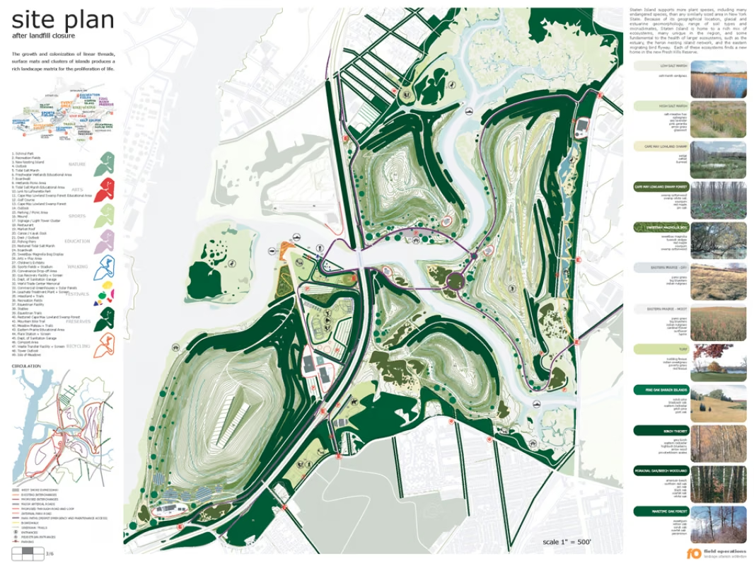
Field Operations, Fresh Kills site plan
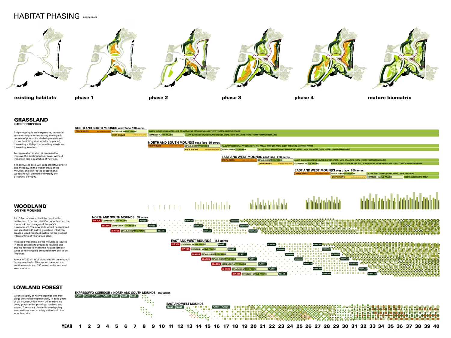
Field Operations, Staten Island Fresh Kills
Hero + caption
Plan over section
Small multiples (material study)
Text left, image right
Full bleed + title band
Two-thirds / one-third
Banner + three columns
Centered focus + margins
Site Title
Anchor drawing
image
image

Stage 0 — messy: misaligned, no focal point, clashing color, crammed to the edges. Press fix.

0 / 4

Before you submit — the one-screen check

  • Aligned to a grid? (slides 9–10)
  • One clear focal point? (15, 20)
  • Reads in greyscale? (6)
  • Limited palette, one accent? (7)
  • Type legible at actual size? (16, 19)
  • Use white space intentionally? (13)
  • Each drawing stands alone, portfolio-ready? (14)
/ 22

Color has three dimensions

Hue · Saturation · Value

#000000

Move one slider at a time — each dimension changes the color independently.

RGB vs CMYK

Additive light · subtractive ink

RGB · light · screen additive
R255
G255
B255

Starts black. Adding all channels → white. This is your screen.

CMY · ink · paper subtractive
C100
M100
Y100

Starts white (the paper). Adding all inks → near black. This is your printed board.

The color wheel & harmonies

Primary · secondary · tertiary · warm/cool

Warm advances · comes forward Cool recedes · falls back Hue

Pick a scheme — then click any hue to set the base color.

Value does the work

Squint test · greyscale toggle

Strong value range
All mid-value

Both look fine in color. Now drop the hue — which one still reads?

Type guides the eye

Hierarchy · flatten toggle

And you will read this last

You will read this first

And then you will read this

Then this one

Top band is read last, middle first — size and contrast decide, not position.

The readability rules

Size · weight · leading · measure · tracking · contrast

Typography is what language looks like. The same words can invite you in or push you away, depending only on how the type is set. Spacing, line length, and rhythm do the quiet work of making a paragraph easy — or tiring — to read.

Bold for emphasis — sparingly.
Space between lines. Body: 1.3–1.5×.
Chars per line. Comfortable: 45–75.
Letter-spacing. Body near 0.
Text vs background. Low contrast = hard to read.

Fix a page

Align → hierarchy → white space → color

Site Title
Anchor drawing
image
image

Stage 0 — messy: misaligned, no focal point, clashing color, crammed to the edges. Press fix.

0 / 4
Huang Gongwang, Dwelling in the Fuchun Mountains, 1350 · Yuan dynasty 黄公望《富春山居图》(无用师卷)
Huang Gongwang, Dwelling in the Fuchun Mountains handscroll

Scroll horizontally → — a handscroll is read a span at a time, never all at once. The emptiness sets the pace.