Thresholds of Winter
2025 · Data Visualization
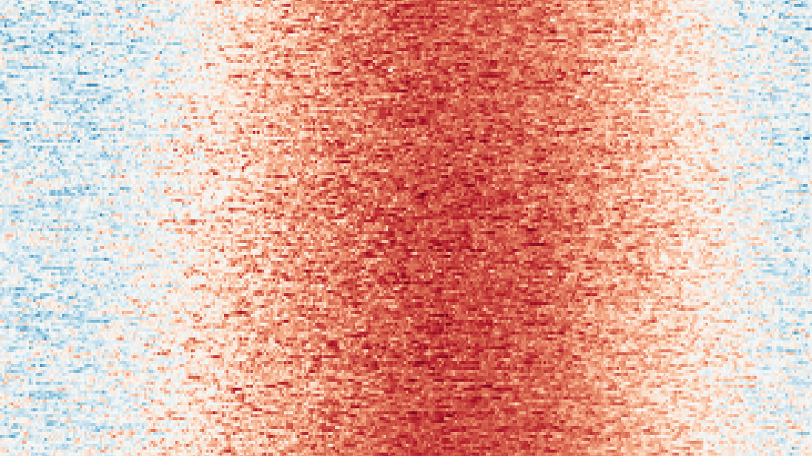
This visualization maps daily minimum and maximum temperatures in Central Park across more than a century, rendering climate as a dense field of seasonal repetition and disruption. Each row is a year, each column a day; read together they reveal long-term patterns that are otherwise difficult to perceive: persistent cold, extreme heat, and shifting thresholds.
An interactive filter isolates days above or below a selected temperature limit — winter chill, hot nights, heatwaves — so the picture holds thresholds and duration rather than averages. Those are the conditions that govern plant dormancy, urban ecology, and lived experience in New York City: a chilling requirement met or missed, a run of nights that never cools.
The spring arrival line estimates when spring-like conditions first appear each year, taken as the first day the daily maximum reaches or exceeds 60°F (15.6°C). The shift toward earlier emergence appears as the line drifting leftward through time.
Explore the Visualization
Dashed lines mark the equinoxes, solid lines the solstices. Hover any cell for that day’s record.